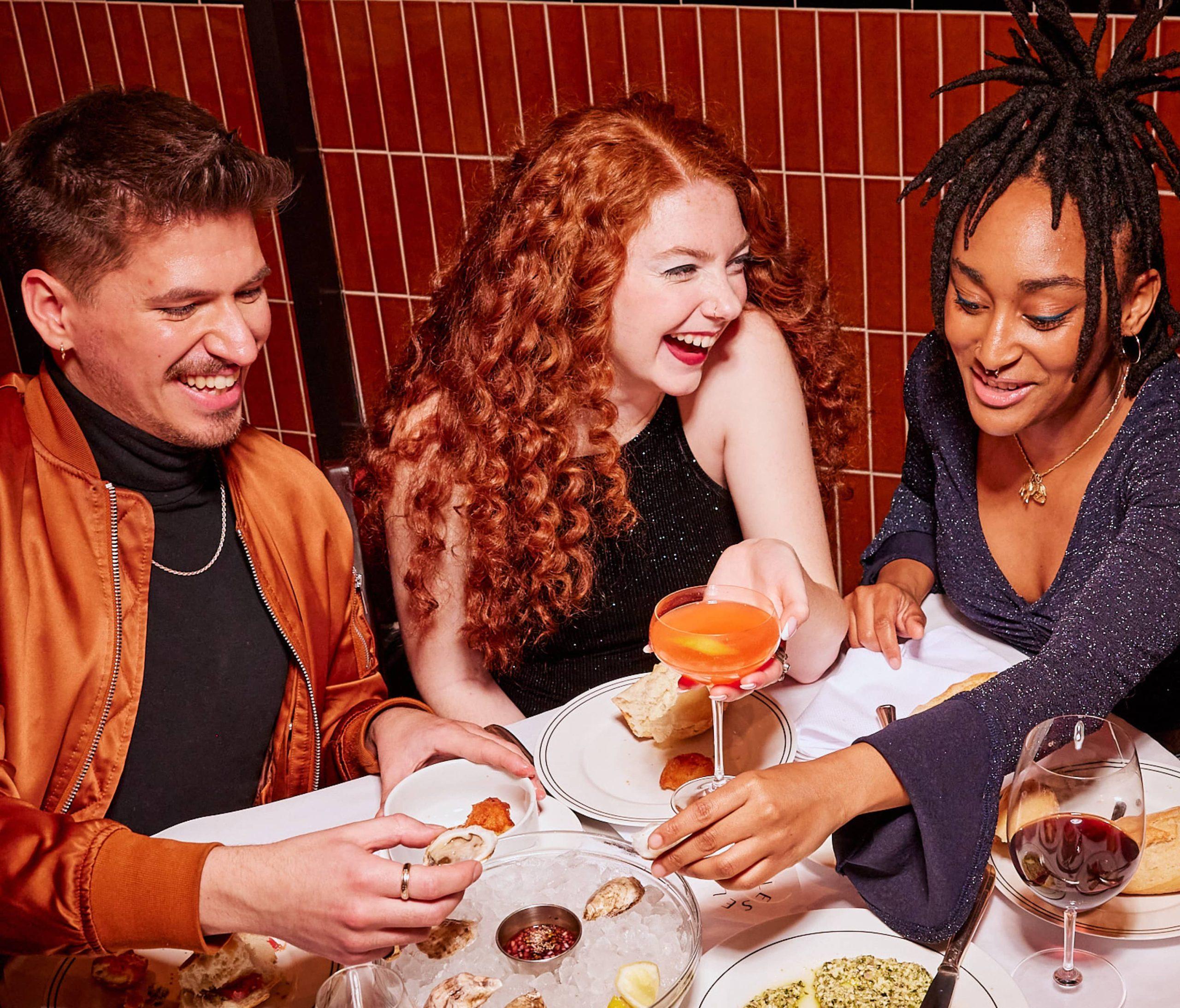
Are you a sucker for nice architecture, or just looking to impress a date? Either way, these London restaurants should set heads turning.

This seafood restaurant in a cavernous Grade II listed dining room is new on the scene. The original design was built to match the grand interior of the Titanic and the restaurant has embraced the early 1900s aesthetic. With its pink banquettes, vintage shell lamps, and pewter-topped oyster bar, it’s an elegant spot for supper.
Petersham Nurseries Café
Definitely more of a restaurant than its name would suggest, this is the kind of place where, order the fennel or the roast leek or the stuffed squash, and the staff will obligingly nip around the corner and pick it for you. Dinner is served in their gorgeous greenhouse: Potted plants. Indian blinds. Overhanging climbers. Mismatched, sometimes a little creaky, lawn chairs. And the odd glimpse of pink, red, and yellow amid the greenery.

Is it a coincidence that restaurants easy on the eye seem to follow Skye Gyngell – formerly of Petersham Nurseries – around? Judging by the olive trees and role of nature as its inspiration, Spring likely takes a few cues from the Richmond restaurant. Soft pastel colours, cloud-like chandeliers, and lots of natural light – it’s a space that’s big and airy but bright and warm somehow at the same time. Not bad for what was previously a tax office.
Berners Tavern
Perhaps most standout at Jason Atherton’s Fitzrovia restaurant is its 300-odd framed pictures. The designers, Yabu Pushelberg, were going for a gentlemen’s club look, maybe even reminiscent of the old school restaurants – the Rules, the Sweetings, the Simpson’s – about town.

Believed to be London’s oldest restaurant, Rules is a bit like your great aunt’s living room. If auntie had a thing for gold trim, marble busts, Turner-like oil paintings, wall-mounted trophies of stag, buffalo and antelope, and Leslie Smith Vanity Fair originals. ‘It’s the Downton approach,’ the MD once told me. ‘Like a country house, over the years you accumulate clutter’.
The Ned
What was once a bank is now home to 250 bedrooms and ten restaurants, including glam Italian Cecconi’s and the California-inspired Malibu Kitchen. When I say bank, I don’t mean the interior of your average NatWest (it was designed by Lutyens – probably the best architect of his generation). More like the stuff you see in heist films like Heat or Inside Man, in fact – huge marble columns, long polished reception desks, a two-metre wide vault door (behind which is a member’s club). All a bit grand, really.

The Ivy’s certainly not known for holding back on its décor – typified by sharp angles and shiny edges, there’s something a bit Great Gatsby about it. The Chelsea outpost, designed by Martin Brudnizki, may well be the most handsome, with its climbing wisteria, roses, fountains, and orangery in a Grade II Edwardian house.
Clos Maggiore
Arriving at Clos Maggiore is like arriving on set at a wedding reception that’s had a lot of money thrown at it. Cherry blossoms, fairy lights, an open fireplace (visit at the right time of year and it’ll look a bit like this). As stunning as it is, the dining room comes with a great disadvantage – everyone else wants to eat in it. So do what you can to book ahead.

Co-founder Will Beckett called Hawksmoor somewhere for ‘close your eyes and go to your happy place sort of food’. At his venues, I’m not sure you’d want to. Spitalfields was splendidly revamped this year; the newest addition, in Borough, has retained its warehouse aesthetic, but with more polished wood panelling. Arguably, though, the Air Street branch and its Art Deco is their most impressive space. The steak is still, more than a decade since the chain first opened, among the best in town.
This is a guest post from freelance food journalist Hugh Thomas. He’s contributed to Foodism, Time Out, Great British Chefs, and is part of British Street Food’s small team of vigilant writers. Find him on twitter @hughwrites.


